
Design and learn about the Olympic Logo has been updated to include the Paris 2024 Olympics.
Olympic Logo Facts
- The Olympic Logo is one of the four major symbols of the Olympic games, along with the medals, touch and mascots.
- Each individual games has its own emblem.
- The Olympic rings are five interlocking rings, coloured blue, yellow, black, green and red on a white field, known as the “Olympic rings”. The symbol was originally created in 1913 by Coubertin. He appears to have intended the rings to represent the five continents: Europe, Africa, Asia, America, and Oceania.
- The word “logo” means an emblem or a symbol that defines the identity of an Olympic Games host city and Organising Committee. It is used as the visual identifier of the event. The London 2012 Logo is all part of the branding package.
- The first time the Emblem for the Paralympics and Olympics was the same was London 2012.
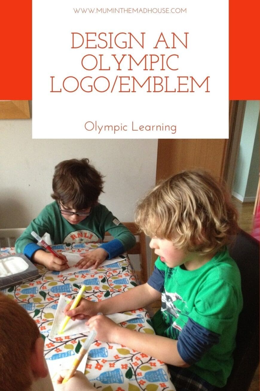
I printed out all of the previous Olympic logos and we made a timeline of the previous Olympic games from them, adding the year and the venue. Using our atlas we looked up where each of the countries were and with our Flags of the World sticker book.


We looked at the London 2012 Logo and discussed what we thought of the design and then had a go at designing our own logo’s.
What makes a good Emblem and what should it include?
We decided that a good logo or emblem is a lot like a coat of arms so should have a characteristic symbol, lettering naming the event location and year, and the Olympic rings.
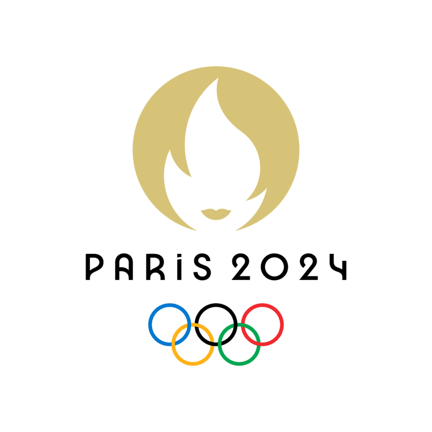
Paris 2024 Emblem and Logos
Like London 2012, The Paris Olympic and Paralympic Games both share the same emblem. You can download a copy of the Paraolymic one and the Olympic one to colour from our site.
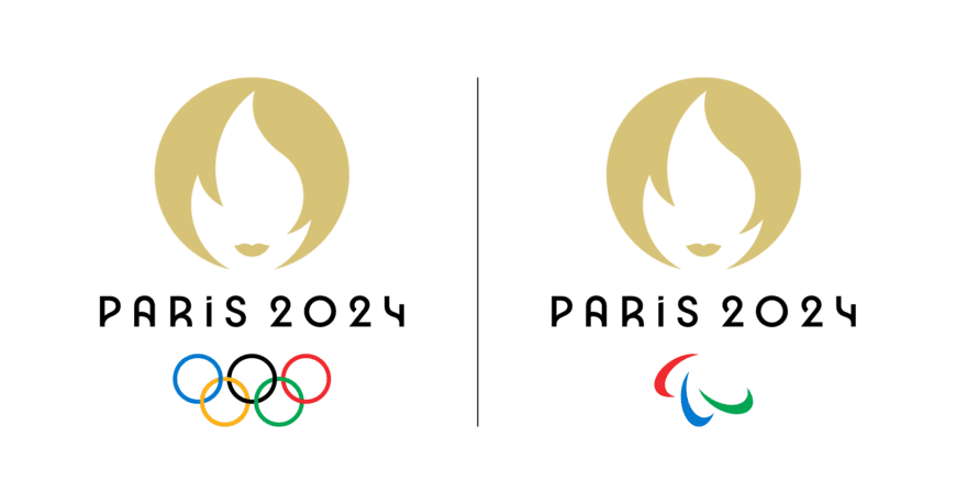
They cleverly combine the Olympic flame and turn it into a woman’s face. Marianne is a national symbol for the country and is a reminder of the Olympic Games in Paris in 1900 ashis was the first ceremony where women were allowed to compete.
Comments are closed.